City of Lincoln
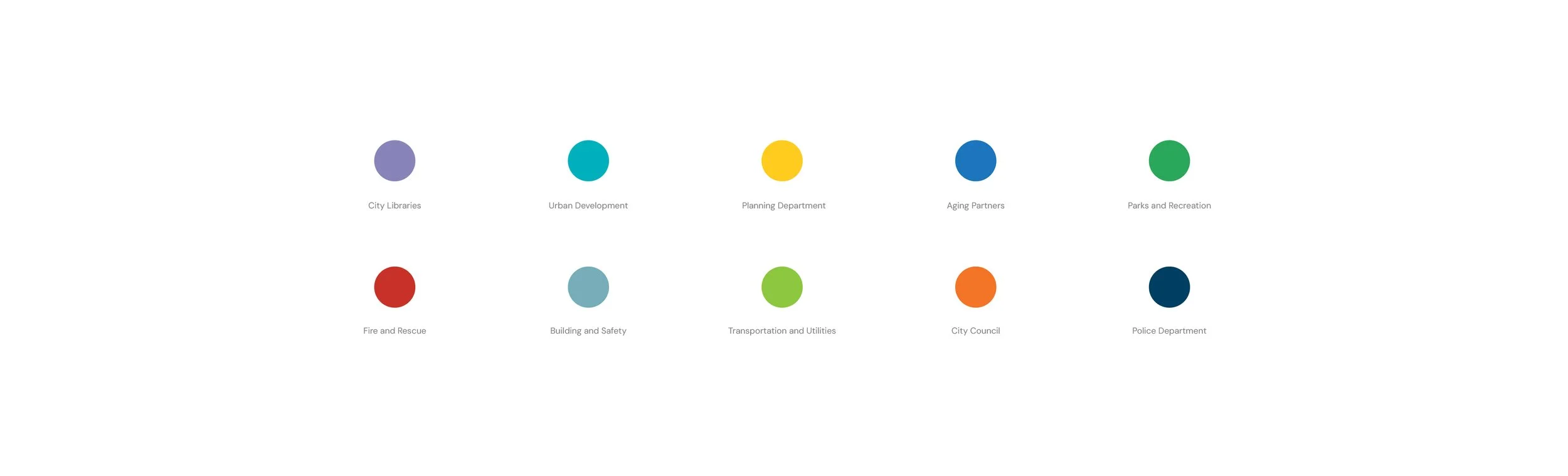
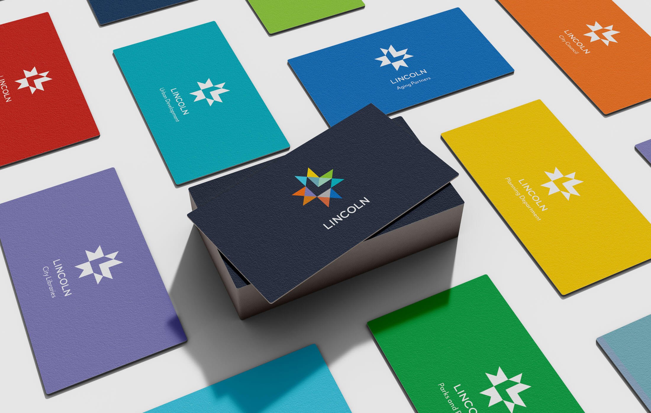
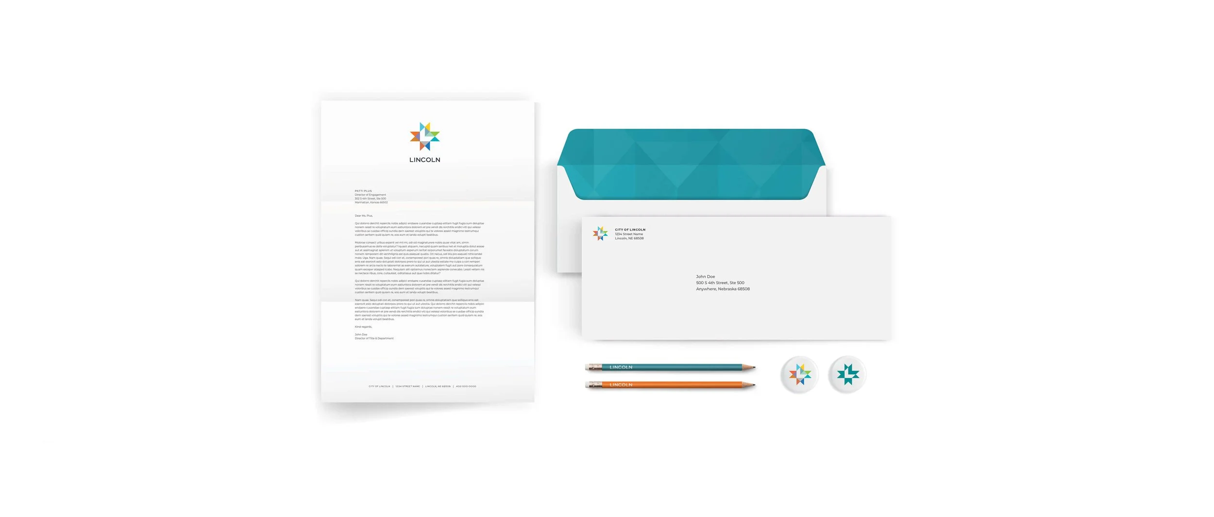
When the City of Lincoln tapped Agent to create a new logo and visual identity for City government, we were excited for the challenge. The identity system needed to work effectively for the City’s multiple departments and functions, while also showcasing the City to the residents it serves every day. In addition to an initial research study, the project also included a complete communications suite — from letterhead to vehicles to signage — and a comprehensive visual identity standards guide.
Logo & IdentityAudience Research & InsightsBrand Architecture & StandardsGraphic DesignEnvironmental Design


The Symbol
The logo uses an eight-pointed star found throughout many cultures and belief systems, primarily meaning rebirth, wisdom and new beginnings. The colors and points of the star represent the City’s multiplicity, where every person, community and city department has a place and a vital role. The typeface was chosen for its readability and visibility, even at small sizes, and conveys a sense of both authority and approachability.